
Vistatec Brand Guidelines
Welcome to the Vistatec brand identity guidelines. The purpose of this guide is to give you an overview of the key elements of the design and a few examples of how to apply it. We recommend that you read through this guide before starting any design work. Our aim is to give you all the help we can to produce high quality, consistent design that really brings our brand to life. Whether you are a member of staff or a supplier, you must follow these rules. A brand is made up of a combination of the elements which are used in a variety of applications. These guidelines will explain how to use the elements so that the style and brand are used in the correct way. Every application must maintain the ‘spirit’ of the identity and be well-designed.
BASIC ELEMENTS
1.1 UNIQUE SELLING PROPOSITION
- Deliver an unrivaled globalization service by working in partnership with you
- Generate a real return on your investment, globally expanding your brand and market share
- Committed to understanding your company’s brand through the development of a long-term professional relationship
- Aim to provide a consistent, global emotional response to your brand, no matter where or how it is viewed
- Has a team of highly trained experts to quickly and efficiently bring your brand to market, supported by cutting-edge technologies
- Provides you with superior customer service that does not compromise on quality, consistency, or reliability
- We are visionaries, pioneering the industry path to the future of globalization
1.2 BRAND VALUES
Excellence // Integrity // Client-Focused // Agile // Visionary
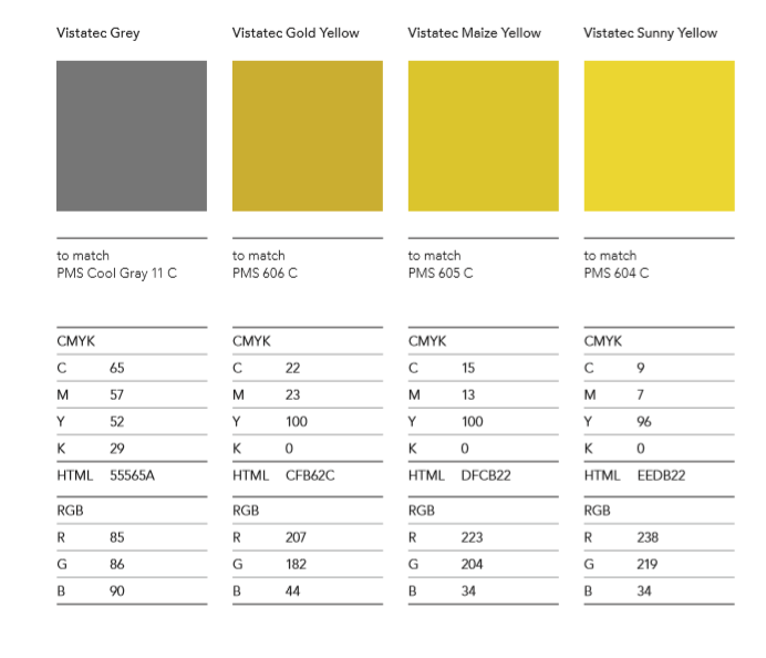
1.3 CORPORATE COLORS
There are 4 main corporate colors that should be reproduced as accurately as possible in whichever medium they are used.
- PMS: Pantone Matching System
- CMYK: 4-color process = Cyan, Magenta, Yellow, Black
- HTML: web safe hexadecimal value
- RGB: Digital Red, Green, Blue values
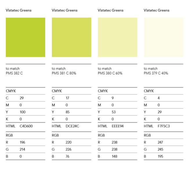
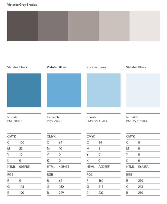
1.4 SECONDARY COLORS
The secondary colors that appear below have been specifically selected to work well together and with the primary corporate colors. The use of these colors is not mandatory, nor are other colors proscribed. Choosing from this palette, however, will provide consistently strong results.
- CMYK: 4-color process = Cyan, Magenta, Yellow, Black
- HTML: web safe hexadecimal value
- RGB: Digital Red, Green, Blue values
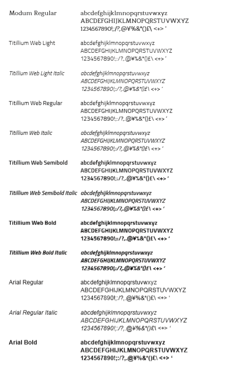
1.5 TYPOGRAPHY
The Vistatec brand typefaces are Modum and Titillium Web. Modum is the main logo typeface, Titillium Web is used on the corporate material while Arial is used for in-house documents.
For ease, a variety of weights have been selected for use throughout the organization (see below).
LOGOTYPE
2.1 MECHANICS
Empty headThe logotype comprises the name and symbol. These elements should be used in conjunction (locked-up) with each other and in the approved color-ways.
The various logotype versions are laid out and explained in this section. They can be obtained in a variety of file formats including EPS, JPEG and PNG files. Please study this section before using the logotype.
Unique logos are not allowed, without exceptions. This undermines efforts to build a unified Vistatec brand. Please contact the Marketing Team if you have questions or concerns.
The logotype has been created in a number of color-ways, which are explained in more detail within this section. Do not try to alter any aspect of the logotype and do not try to recreate it. Use only the logotype which has been supplied and approved.

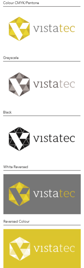
2.2 COLOR VERSIONS
For documents with high-quality print reproduction, it is best to render the logotype in its four corporate colors. Always try to get a good color match.
Reversed, white, black, and grey versions are also provided for when color is not possible. The logotype can appear on a colored background. It should only appear on an approved corporate color or color that will ‘hold’ the detail. Make sure the correct version of the logotype is used.
When on a colored background, the logotype can be as shown depending on the quality and contrast of the background.
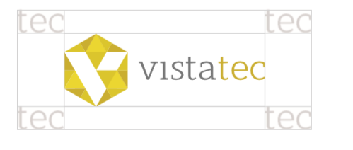
2.3 EXCLUSION ZONE
An exclusion zone—the minimum unobstructed area around the logotype—has been developed to make sure that the logotype is sufficiently prominent. For all logos, the exclusion zone is determined by the size of the ‘tec’ in Vistatec. The measure of this space is the minimum unobstructed area around the logotype.
Do not allow type, rules or any other graphic device into this area. An acceptable colour may run through the entire background as specified in Section 2.2.
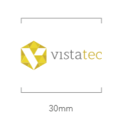
2.4 MINIMUM SIZE
For clarity and reproduction quality, do not use any logotype smaller than the one shown (30mm). Use the correct version of the logotype depending on the size requirement and reproduction quality.
2.5 THE BRAND NAME
On all documents, the brand name should always appear as one word, with a capitalized V and a lowercase ‘tec’:
Vistatec
SENDING FILES TO PRINT
You will be unable to view Illustrator and Photoshop files supplied without the proper applications. JPEGs have been supplied of all logos for in-house use so you have a visual guide of what is on the disc and what you are supplying to the printer.
The Illustrator/Photoshop files should be supplied to design agencies and printers when organizing a reprint of any of the brand materials.
The Vistatec brand guidelines should accompany logos supplied to printers or design agencies. These have been supplied in PDF format. Please retain a copy of your brand guidelines at all times and send a copy when organizing a reprint.
The RGB files (saved in For Screen folder) can be used for internal documents, eg. Word documents or PowerPoint.
Logotypes, documents, and other artwork not supplied can be obtained by contacting Vistatec directly.